Landing Pages
Creating a comprehensive component library, designed to be future-proof and rock-solid at scale.
Ooni, 2024
Creating a comprehensive component library, designed to be future-proof and rock-solid at scale.
Ooni, 2024
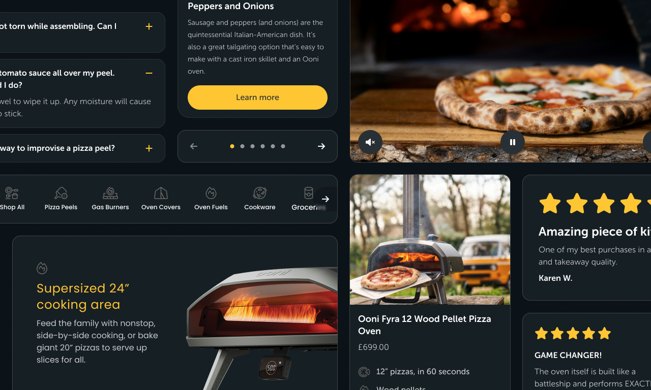
Ooni's marketing materials and social media drive substantial traffic to landing pages aimed at customer acquisition. Built and maintained by a small team, these pages are crucial for eCommerce, so it's important to get them right.
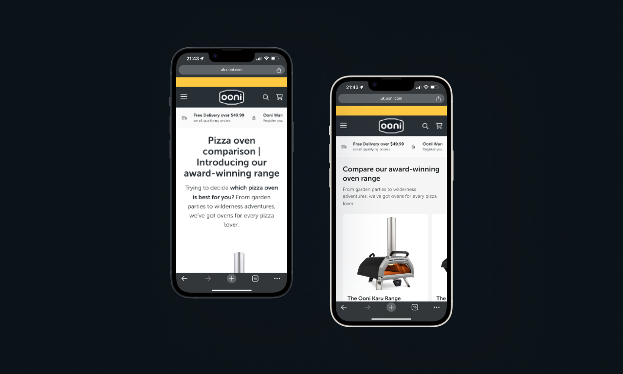
I led the design of a versatile component library, enabling content editors to easily create editorial pages. Collaborating with engineers and a project manager, we significantly boosted page load speeds and ensured UI consistency across landing pages.
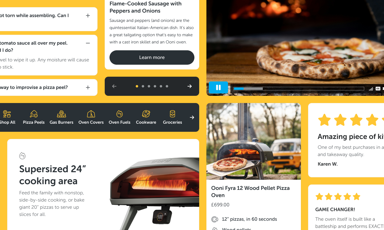
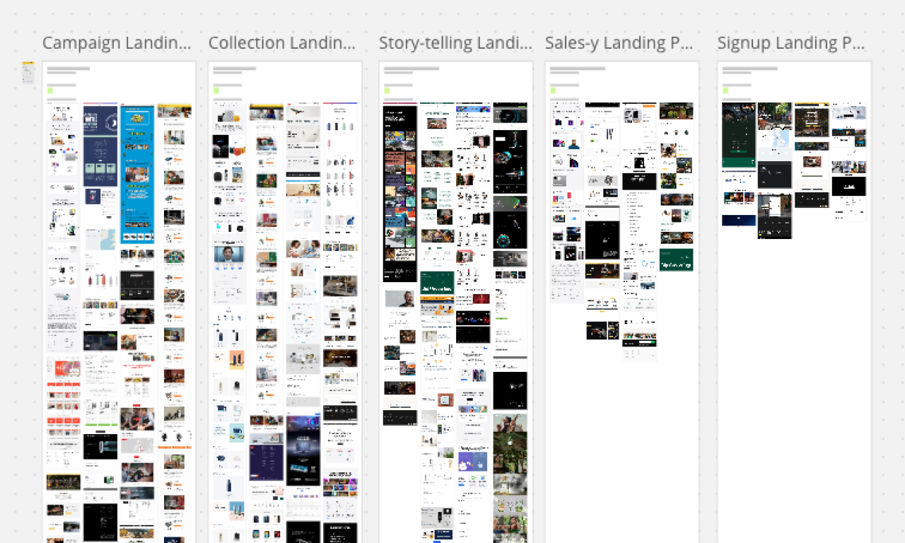
This overhaul resulted in a more visually engaging user experience, helping potential customers connect with the brand. The component library, created in Figma, allowed the design team to rapidly mockup high-fidelity marketing pages with stakeholders.
From the outset, content designers were involved. Through UX workshops, we identified storytelling needs, pain points, and opportunities. These key pages had high bounce rates due to slow page loads. A major contributor to this was bloated, outdated JavaScript libraries and UI components. We tackled this issue by building new, simpler components from scratch.
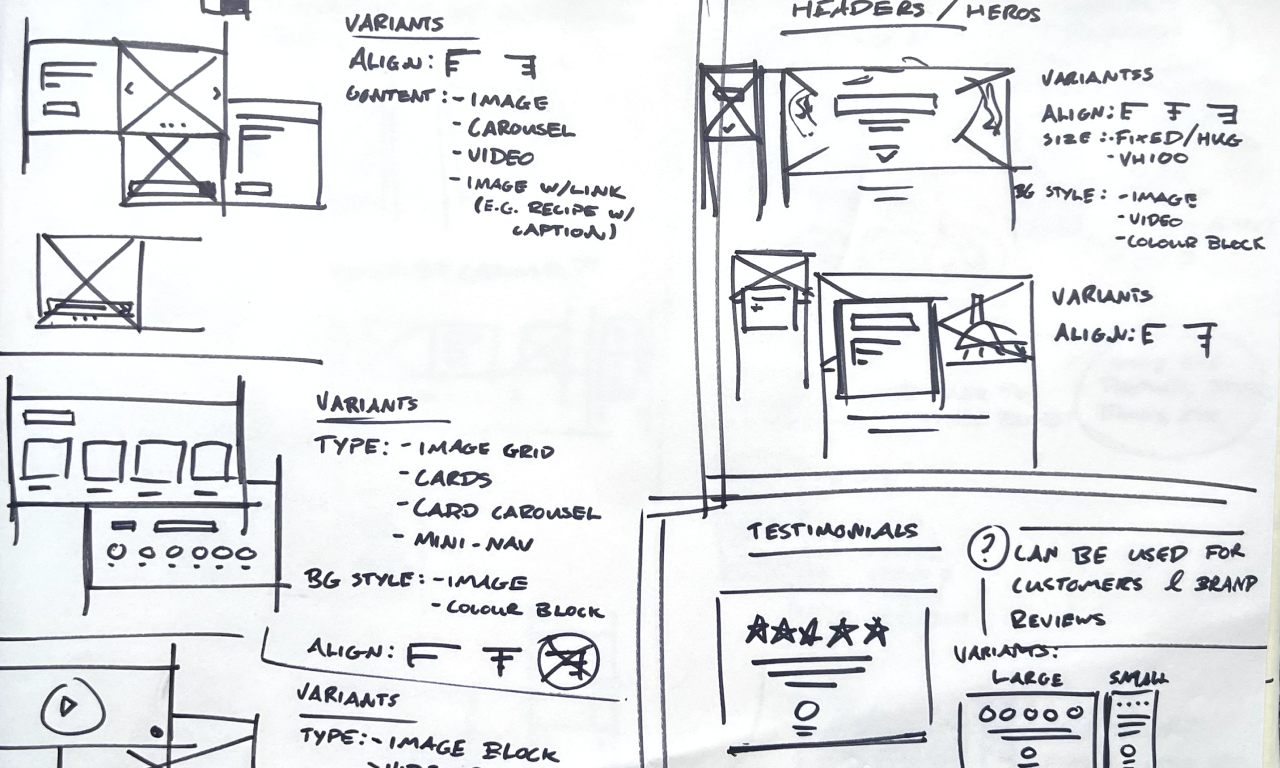
After defining requirements, a shortened design sprint helped us outline necessary components and a scalable approach. I led the UI design based on Ooni's brand guidelines, ensuring the components were theme-able in Figma to adapt to future rebranding. Accessibility is always a priority for me, so all themes were design to align with WCAG 2.1 Level AA.
A timeline shift to accommodate Black Friday and Cyber Monday allowed us to pilot the new components and refine them before full launch. Collaborating with engineers to troubleshoot issues and make small improvements has been key to my success in design.
Creating a theme-able Design System in Figma uses some pretty advanced features. The four themes (Light, Dark, Accent, and Midnight) used colour, text, and other style variables to completely changed the look and feel, using Tokens. This made the solution more flexible and extensible, for use in future projects and to lay the foundation for an upcoming brand refresh.
The new components were well-received and have been used in key editorial pages, including recent product launches. We later added a new theme, Midnight, to align with Ooni's rebranding.
Building design systems is about creating a seamless experience for users and fostering inter-departmental communication. The updated look and feel improved pages throughout the customer journey. Additionally, the design team gained the ability to create high-fidelity mockups in real-time, enhancing efficiency and stakeholder approval.