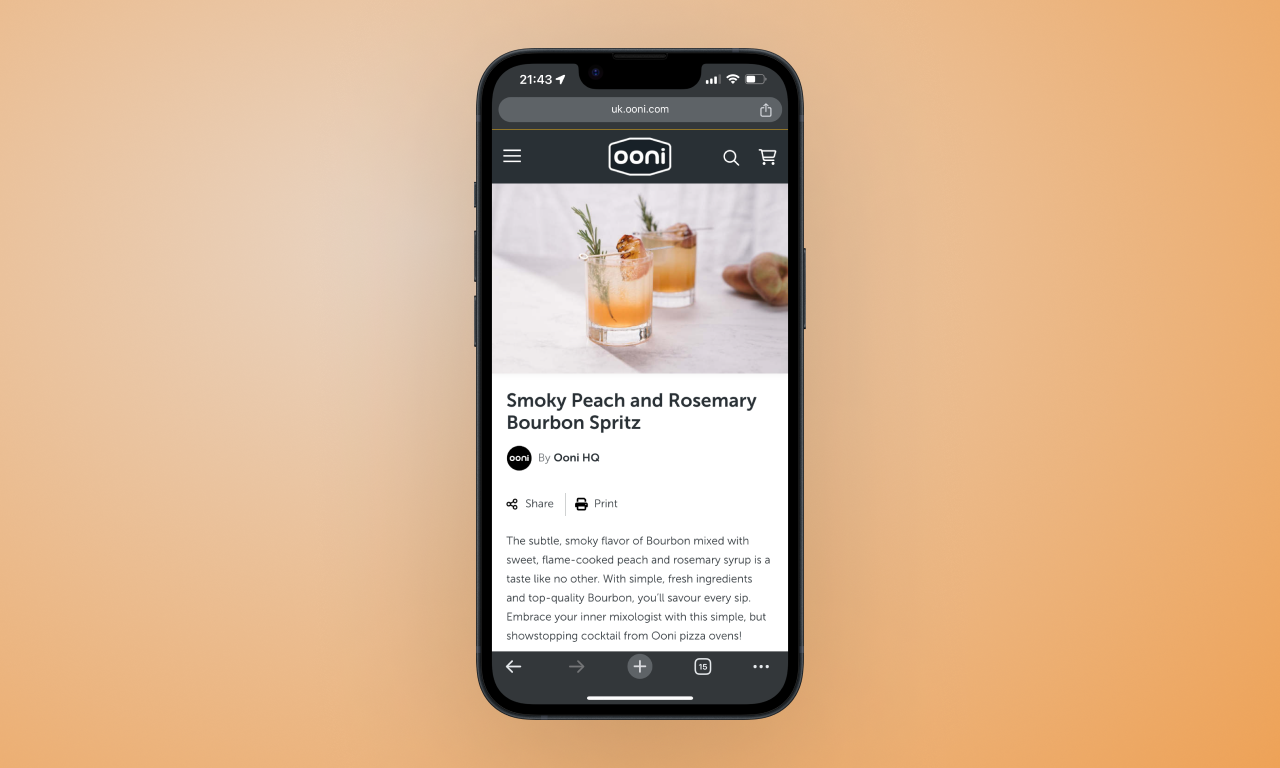
Recipes
Refactoring a dated blog template, with a user-centric approach to content and design.
Ooni, 2023

Refactoring a dated blog template, with a user-centric approach to content and design.
Ooni, 2023
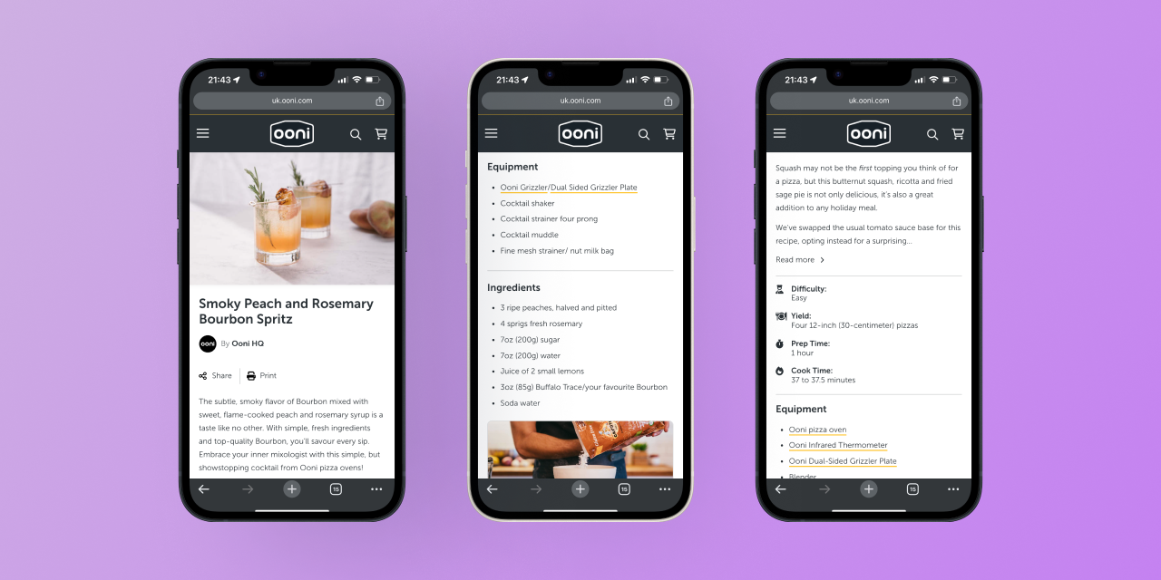
Recipe pages often frustrate users online. To redesign Ooni's recipe pages, we focused on user and business needs. The result? An SEO-friendly, content-rich, and readable template.
A consistent yet flexible template enabled Ooni's content team to craft delicious new recipes. This editorial freedom, paired with an improved UI, delighted customers. These changes extended to Ooni's in-app recipes on iOS and Android, and blog pages.
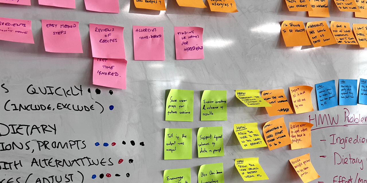
We began by listening to users. Through usertesting.com, we observed them navigating popular food websites to find interesting recipes. They then completed a card sorting exercise, helping us identify what information is critical to our customers.
Users favoured clean, simple instructions. This insight shaped our content presentation and UI design: clear, simple, beautiful.
Users also disliked long paragraphs often found on food blogs. To balance SEO needs without bloating the pages, we strategically integrated necessary information.
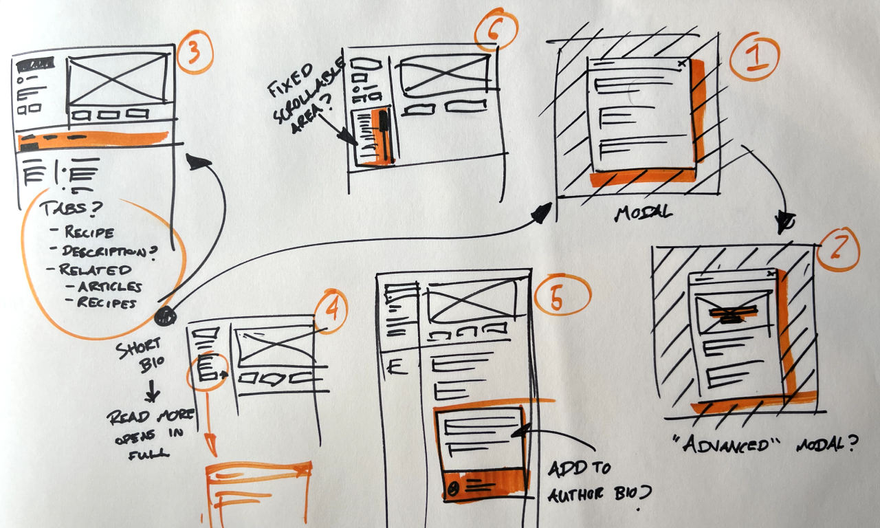
Internal stakeholders had ambitious content plans. We collaborated on a structure that was readable and scalable for various recipes. This guided our UI design workshops and helped identify edge cases.
The result is a simple, scalable layout suitable for all recipe types on Ooni's website, from pizza to desserts and drinks.
Even the most tech-savvy users can't escape paper: a lot of people mentioned printed recipes. We catered to this need with a custom HTML and CSS print layout. It's attention to small details that add up to a significantly enhanced user experience.
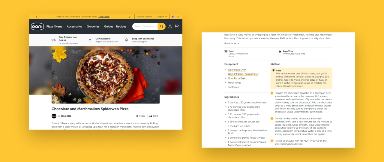
The changes received positive feedback from users and the company, which was reflected in their performance. More people were spending more time on these pages. We extended the new design to Ooni's iOS and Android apps and updated the old blog template. These touch points are crucial for brand engagement.
Post-launch, the pages attracted more traffic with a lower bounce rate. The company used this opportunity to upsell products through recommendation carousels. With more time, I would have like to make these elements fit more naturally into the design.
I strongly advocate for Inclusive Design. Collaborating with customers and stakeholders on this project allowed us to see the problem from different angles, and create a solution that worked well for all.
While there are always areas for improvement, the redesign successfully met user and business needs. With more time, integrating videos and product carousels would have been ideal.